Welcome to my blog. Here is where I discuss various projects I’ve been working on. I’ve been experimenting with different arts and crafts mediums for several years. Currently, I am working to improve my drawing and painting skills. I have posted some of my current works on my facebook page and instagram. I am always open to questions and comments.
Remember to fill out the contact/email form to be informed of specials, events, answers to questions.
Hi all, and welcome to my blog. I’ve been practicing watercolor techniques and focusing on backgrounds and different textures in nature. In this project, I worked from a photograph I took of a heron bird that was fishing in a dock area. The backdrop to the bird was a bay with a pier that separated it from the ocean, a tip of the island, and a blue sky with pale purple clouds.
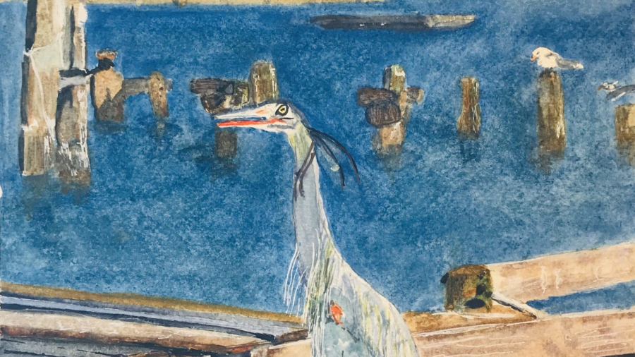
The first rendering I tried and which I wasn’t satisfied with, was quite a challenge. The sky came out well though. The first thing I did was lay down the wash of the sky and while it was damp, dropped in some violet for the clouds. Next I used a cotton ball to dab around the cloud edges to soften and blend into the sky. After masking out around many of the edges of the features that were next to the water, I laid a wash of ultramarine blue for the water. Then, I focused on the islant details adding a couple palm trees. Next, I worked down the page painting in the details of the pier, wood moorings, dock features and a boat. There were various wood tones and water marks to depict. Last I rendered the bird and worked on feather details and facial markings. Lastly, I went back to the water to try to add wave textures, highlights, shadows, ripples, on the water with browns, and Cerulean Blue. Well, the water came out blotchy and the shadows and reflections around the wooden posts came out messy.
On my second try, the wood beams and post textures and colors came out better. This time I used Ultramarine blue for the deep ocean, cerulean for the bay and foreground around the docks. Still the water area in the mid-ground came out blotchy and overworked and the reflections of the posts still looked messy. My artist husband suggested taking some of the focus off the pier and island as they detracted from the heron.
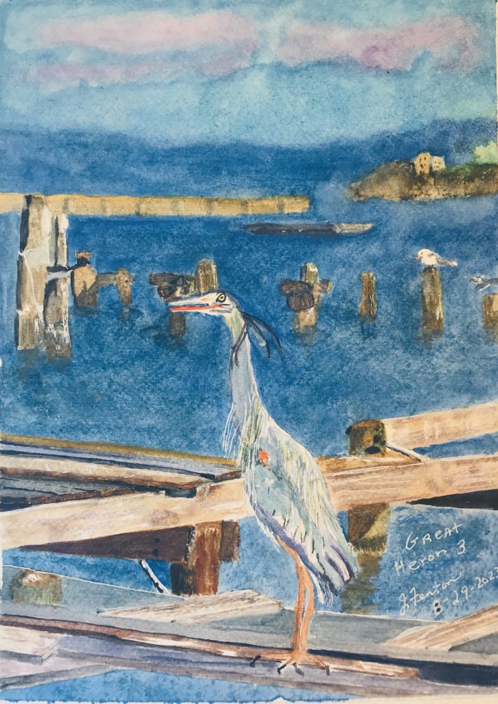
Here is the final painting. I’m not too happy with the sky and may, in the future, try again. This time, I removed the palm trees and blurred the pier and island to keep the focus more on the bird. The details of the wood posts jutting out of the water a more subtle but the contrasts between light/dark are more definitive.
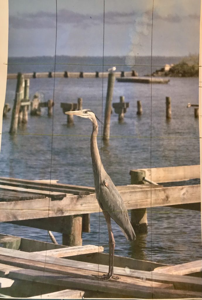
Here is my reference photo. The coloring is off because it is a photocopy print. I also had better prints for reference on the colors. I altered somewhat. I took out a large post and eliminated some of the boards at the bottom. I placed the seagull on a shorter post.
I think the bird detail and coloring are good and stand out. This time with the water, I first did a wash of Cerulean Blue then when the details were all finished, I added some texture with ultramarine blue with a sea sponge that I dabbed in the paint. Overall it was fun experimenting with the colors for the wood, the heron, and the water.