Dance of Life
What is this 'dance of life'? We step and hop, get down, skip, leap, gambol, and romp.
Where are we in this dance?
     Some like to swing and spin. Others play at bossa nova. I've seen many strike a pose, posture, and stomp. Do they ever get what they want?
     Many follow the same old tune. They walz, plie`, promonade, sashay. In times of frenzy, we jig, reel, quiver, convulse. Seeking to find release.
In times of glee, we samba, jitterbug, twist and shout, soft shoe, or fox trot.
At times, we use the dance to intimidate. I see a whirling tarantella, a prancing flamenco, bull-fighting bolero, a cassock daring, and a couple positioning in a bold, dynamic tango.

But the serious mechanic demonstrates precision by taking a moonwalk glissade, twisting their bellies, spinning on their heads or back-bending a limbo under a pole.

The Irish clog, the Polish polanaise, Chubby twisted, and the French kicked the can-can.

Let's not forget romance. That main purpose of dance to entice, entangle, move together, move apart. The romantic lambada, cha cha, waltz, booty dancing, swinging, bumping, and again the tango.

At parties the gang is all in to conga, catillian, minuet, twist, do-si-do, promenade and dixie chain.

This man, he makes excuses to dance. He dances to the rain, to the gods, to life, liberty, to birth, marriage, war, and death.

Where are you in this dance of life? Where do you choose to be?
There are wanna be's, watchers, sitting on the side lines waiting to be asked. There are show-offs looking to the lime-light, seeking fame. The leaders invite, gather, and start the ball. Encouragers give hope to the novice and compliment the learners. The professionals teach and emphasize skill and perfection. They are the graceful, lovers of precision, working 'til their feet bleed.

But isn't dance a thing to admire and experience and feel? Isn't dance beauty, grace, expression?

Listen to the rhythm of your song. Is it noise? Is there a beat? Sometimes our feet become tangled. I usually go left when others go right. It's awkward to follow the crowd though that's what our mind wants. It tells us fit in, stay in line, don't cross the line. But our soul may be singing its own song.

Maybe it's time to stomp, kick, or clomp. Or it may be time to sashay, skip, or swing.

How about we take time to twirl like a child whose spirit is free. Spin, spin, spin until dizzily we drop,  recover and we dance some more. Anyone want to Lindy hop?
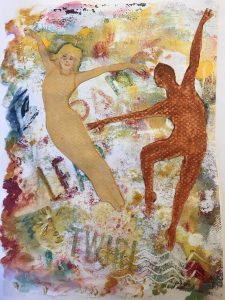
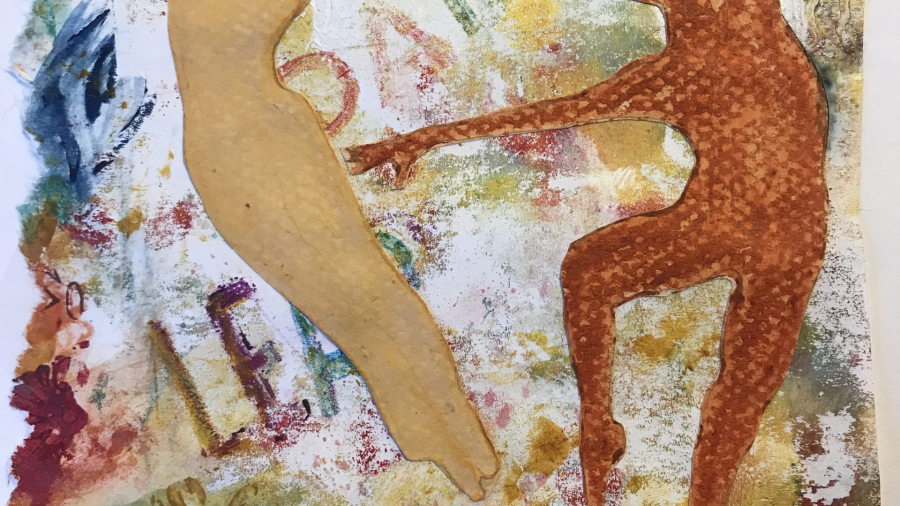
Here is a journal page I made about dance. Using Stencil Girl Products stencil "Dance of Life" for the figures and words. I may use it in the memory books for my mom.
- Stencils – Sjodin m217 “The dance of this life”, and borders
- various brands acrylic paints
- Gelli Arts gell plate
- Ranger distress crayons
- Carun Dache Crayons – neo color II water soluble
- Prismacolor water color pencils
- canson pastel paper – gold neutral
- Do Overs
“Change is not made without inconvenience, even from worse to better.” Richard Hooker, English Theologian (1554-1600)
Sorry, it’s been a while since my last post. Besides trying to improve my watercolor skills, I’ve been going through my paintings sorting and analyzing. This is something I recommend for all artists to do from time to time. It helps you to see your progress as an artist and keeps you on track for your chosen style and technique. I was able to weed out paintings that were not so good. Also, I found some that I liked the subject, but thought I could change something about the painting. Then I proceeded to re-do the piece.

Here is an example. I used this photograph as a reference for both paintings I did. For the first painting I did about a year ago, I copied the composition just as the photograph shows. I included all the fence, trees, flowers, etc. But on the new painting, I changed the top area, eliminating the big tree in the center and I added some mountains and sky. On the bottom right, I emphasized the pattern of shadows. Unfortunately, I tossed the first painting so I don’t have an example of it, but I have included a photo of the final painting I did about a month ago.
Everything was painted a little looser on the blossoms and the patterns on the jar. I de-emphsized details on the right hand tree letting it appear in the background. Grasses were added with a sponge dipped in paint. I used some texture on the rocks in the mid-ground.
Tuscany Garden Watercolor I hope you like this painting and enjoyed the post, On the next posting, I will include another painting I’ve revised. On that painting I will include photos of both paintings. Remember, it is sometimes difficult to be honest about our ‘precious’ creations. But in the long run if we analyze and see good changes that could be done to improve our skills, we will make progress as an artist.
- New Artist Bio and Event Page
Artsy News Page
Good Day. Decided to start up my blog again after holding off for a while. I was revamping the site and adding some features which I hope will be helpful. I added a page titled /ArtsyNews for artist biographies and event notifications. I’m still working on that a little bit and need to make some contacts to set these features into motion. My plan is to provide an online questionnaire for artists to help choose featured artists and use it to assist in writing the biography.
What’s been going on?
On the home front, we have been in our home for two and a half years now, time flies. We are lagging behind in our landscaping goals. We lost some trees in a storm in August and had to have the stumps removed. Also, we decided to move some of the soil from the area where the tree was over to the front yard to gentle the slope. Winter set in so we’ve been waiting to bring in more landfill and finish off the retaining wall. We recently bought two sweet Australian Shepherd-mix puppies and they are growing fast. We are now going to build a fence for them in the yard in the next few weeks, weather permitting.
Besides designing the web page and gardening, I’ve been learning watercolor skills and practicing my sketching.
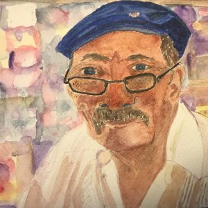
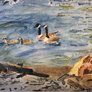
Here are two of my recent watercolors. On Fabriano i264 140lb cold press paper.
Old Italian gentleman, professor Coosawattee River Stop Over
- Happy New Year
Welcome to 2024! I am making some changes to my website. So, if you notice things are different or keep changing, that’s the reason. I’ve added some new templates which have placeholder text which may not pertain to my site. Until everything is working as I like it, I probably won’t post much content. Thank you for your patience.
- Adding texture to drawings.
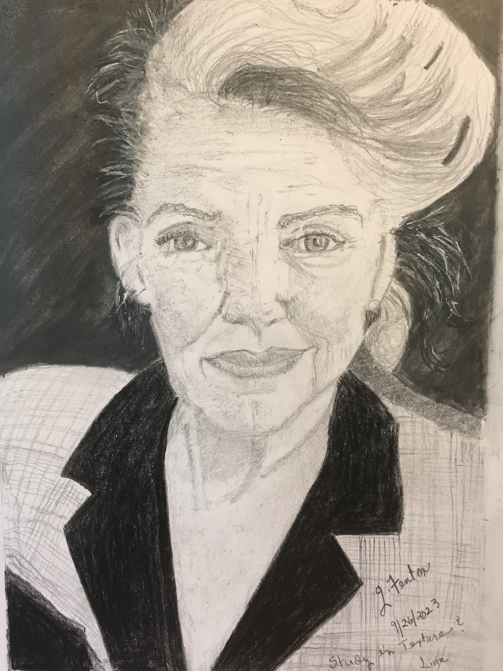
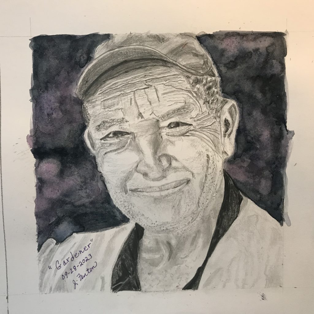
In recent drawing exercises, I wanted to add some dimension and texture to portraits. This is mostly done using a variety of line shape, line size including length and thickness. We can also use line in shadowing areas or changing the direction of the shading.
My husband recently gave me a book for reference so I could improve my sketching and drawing skills. The book by Paul Calle, “The Pencil” copyrighted in 1974 by North Light Publishers, is a true inspiration. The book showcases a variety of his drawings and illustrations which he uses to demonstrate a variety of skills. Paul says “his study of wood engraving had the most influence on the technical direction that my drawings have eventually reached.” One technique he uses is using patterns of strokes that lead the eye and give volume to the body or object. Paul includes a chapter on values and textures with illustrations of various lines and patterns to practice. He talks about paper texture, and suggests using a variety of pencils.
I am not reproducing any of the samples in the book, though, I am suggesting that you find a copy for yourself. (If you can find a copy).
Instead, I am including a couple of my drawings where I tried out some of the techniques.
These subjects were both elderly and had lots of wrinkles that added to the line and texture. The drawings were from photographs, I found in my stash of drawing subjects. On the female subject, I tried to capture the texture of the velvet collar and variety of line direction, light and dark to capture the plaid of her jacket. It was fun adding a variety of marks to render freckles, hair, eyebrows, and shadows. For the dark background I used a 6b black watercolor pencil and a water brush to form diagonal brushstrokes to direct the eye. I tried several tools to make the white fly away hairs, including pen, colored pencil, erasure, but the most success I had was acrylic white diluted with water and dabbed in places.
The patterns of shadows in the jacket and shadowing on the face and neck were rendered in a variety of graphite pencils in HB, 3B, and 6B. In some places I used a stump to blend. It was fun learning how to add the wrinkles with line and erasure. For the freckles and hair stubble I used pencil point and squiggly marks with HB and 3B. It was difficult capturing the eyes, because they were so squinty and the photograph didn’t show any iris. I mostly used line and shadow to depict the shapes. At the last minute, I decided to add a watercolor background. I added some purple to add contrast to the dark blacks.
I hope you can find this book. If not, see if you can find some of his artwork online. In 1962, Mr. Calle participated in the Air Force Historic Art Program and the Artists in the Park program initiated by Mr. James E. Webb administrator of the National Space and Aeronautics Administration. Calle was fortunate to be able to produce illustrations of some NASA rocket launches and the first astronauts into space. Some of these are reproduced in Calle’s book. Have fun with this.
- Water and Wood Textures
Welcome to my blog. Here is where I discuss various projects I’ve been working on. I’ve been experimenting with different arts and crafts mediums for several years. Currently, I am working to improve my drawing and painting skills. I have posted some of my current works on my facebook page and instagram. I am always open to questions and comments.
Remember to fill out the contact/email form to be informed of specials, events, answers to questions.
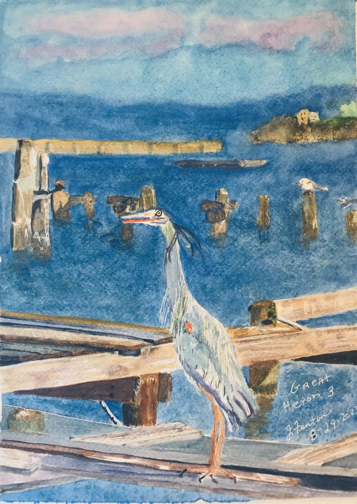
Hi all, and welcome to my blog. I’ve been practicing watercolor techniques and focusing on backgrounds and different textures in nature. In this project, I worked from a photograph I took of a heron bird that was fishing in a dock area. The backdrop to the bird was a bay with a pier that separated it from the ocean, a tip of the island, and a blue sky with pale purple clouds.
The first rendering I tried and which I wasn’t satisfied with, was quite a challenge. The sky came out well though. The first thing I did was lay down the wash of the sky and while it was damp, dropped in some violet for the clouds. Next I used a cotton ball to dab around the cloud edges to soften and blend into the sky. After masking out around many of the edges of the features that were next to the water, I laid a wash of ultramarine blue for the water. Then, I focused on the islant details adding a couple palm trees. Next, I worked down the page painting in the details of the pier, wood moorings, dock features and a boat. There were various wood tones and water marks to depict. Last I rendered the bird and worked on feather details and facial markings. Lastly, I went back to the water to try to add wave textures, highlights, shadows, ripples, on the water with browns, and Cerulean Blue. Well, the water came out blotchy and the shadows and reflections around the wooden posts came out messy.
On my second try, the wood beams and post textures and colors came out better. This time I used Ultramarine blue for the deep ocean, cerulean for the bay and foreground around the docks. Still the water area in the mid-ground came out blotchy and overworked and the reflections of the posts still looked messy. My artist husband suggested taking some of the focus off the pier and island as they detracted from the heron.
Here is the final painting. I’m not too happy with the sky and may, in the future, try again. This time, I removed the palm trees and blurred the pier and island to keep the focus more on the bird. The details of the wood posts jutting out of the water a more subtle but the contrasts between light/dark are more definitive.
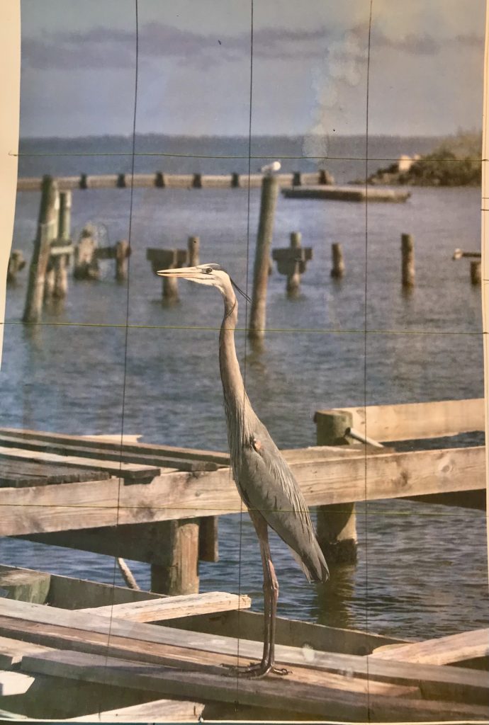
Great Heron 3 Here is my reference photo. The coloring is off because it is a photocopy print. I also had better prints for reference on the colors. I altered somewhat. I took out a large post and eliminated some of the boards at the bottom. I placed the seagull on a shorter post.
I think the bird detail and coloring are good and stand out. This time with the water, I first did a wash of Cerulean Blue then when the details were all finished, I added some texture with ultramarine blue with a sea sponge that I dabbed in the paint. Overall it was fun experimenting with the colors for the wood, the heron, and the water.