“Marriage should be a duet–when one sings, the other claps.” –Joe Murray
This posting is not so much about technique, but how I choose elements in my design to communicate message and mood of my memories. It is amazing how my memories have come alive as I sort through old photos. I’ve been making a memory book about my father to share with my children and grandchildren. I’ve learned how little I knew about my dad’s life prior to my birth. I’ve filled in details from photos or stories that he told me as a child and as an adult.
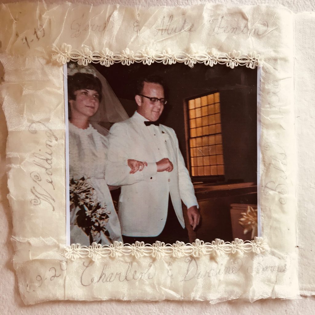
This is a photograph someone took of Daddy walking me down the isle on my wedding day. I love the expressions on our faces. Unfortunately, because I didn’t have a professional photographer, most of the photos of my wedding came out poor. Others taken with Polaroid have faded and don’t reproduce well.
TEXTURE IN DESIGN
I didn’t like the cottony texture of the memory book page, so I decided to embellish the paper. First, I used silver ink and chose a frilly font to add text.
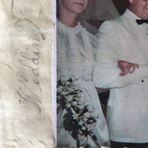
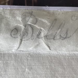
You can see some details of the fancy font in this photo. I had a remnant of organza tulle fabric used to make veils.
I used this to dress up the page and give it a sheen. The fabric is tufted so the words do not pop out in the photographic image. Even in reality they are muted.
Below you can see the paper texture before I added the fabric. It is quite casual and after you can see the sheen of the Tulle fabric. In this photo you can get a better idea of what the text looks like under the fabric.
PLACEMENT AND SIZE OF ELEMENTS
At first I was going to glue the fabric over the complete page but then I realized I had to add the text first. When placing text, I use a piece of graph paper and draw the page on it same size as the book page. I use the graph paper with pencil to design the text size and placement. If the book paper is thin enough, you can transfer your text using a light table. In this case, I had another page behind this one so I couldn’t transfer. I just lightly copied with pencil the text style and size onto the paper. Then I traced over with the acrylic silver ink. When the ink is dry, any stray pencil marks can be erased.
I realized the photo wouldn’t stick down to the tulle fabric so I glued the photo to the page and cut the tulle into four sections to fit around the photo. Tombo mono liquid glue “Aqua” worked well to glue all the parts down to the paper. It dries quick and clear.
COLOR IN DESIGN
So, the colors in the photo are neutral. I wanted to use silver text to make it formal to capture the mood of the wedding event. My dress and my father’s tuxedo were white. I used creamy off-white for the fabric and lace to embellish the photo and tie the text to the photo image. My mom made my wedding dress. It was the sixties and mini dresses were in vogue. She sewed floral lace on the neckline and down the front, and at the wrist. I had in my stash some cream colored floral lace and decided to border the picture with it.
My older sister and I both got married in 1969. She never said anything but I could tell she was not happy that I got engaged and set my wedding date earlier than her. I didn’t do it on purpose and wasn’t aware of traditional protocol where the eldest daughter married first. All I knew was that I was in love. It did put a strain on my folk’s budget having to pay for two weddings within months of each other and we had to curb our spending. Our parent’s love and dedication to one another served well as a model for both of us. Both marriages have lasted over fifty years.
acrylic Article Blogging bookmaking Cards City collage colored pencil Creativity decorative paper design distressed crayons drawing gell printing gel printing gift tags greeting cards Happiness ink inks journaling Journalism Marketing Media mixed media Modern Music Motion Graphics Mountain Nature Outdoor Painting pattern pencil People Photography Productivity rivers stencil stencils Texture Tips and Tricks topics torn paper Tour watercolor